
The design makes use of simple typography and clean CMYK colours to represent the nature of his business. I went with a retro feel (probably because its for my old man...) that I think suits his business and will look great on his vehicle (now to convince him to let me rebrand it...).
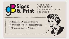
I've chosen an off white, slightly textured paper (preferably recycled) to continue the retro/ vintage feel.


No comments:
Post a Comment